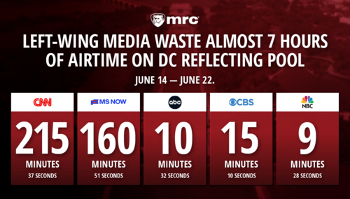
Logo
Shows Freedom is Foundation for a Free Market
A logo is a lot more than just a piece of art that represents an
organization. Its a statement of what an organization is and what
it stands for. Many organizations and businesses embrace symbolic
representations of letters or names an idea that dates to time of
the ancient Greeks and Romans. The golden arches of the McDonalds
logo are typical of this logo type and one of the most recognizable
icons in the world.
Representing a concept is much more challenging and
that was the problem faced by the staff at the Media Research
Centers Business & Media Institute. While the concept of free markets
seems straightforward, it is not easily understood by much of the
public.
Marketing Director Michelle OHalloran, BMI Director
Dan Gainor began the initial discussion by trying to find words and
images about what the free market actually means. The new BMI
mission statement, Auditing the medias coverage of the free
enterprise system, was added to the mix.
The initial ideas focused on concepts like freedom and
liberty, as well as more tangible ideas about business, free
enterprise and markets. Coupled with the media component, that posed
a significant challenge. Trying to create synergy with the main
organizational Web site (www.mrc.org) was even more challenging.
Veteran freelance designer Kristin Pope (kpope@sc.rr.com) was
brought in to add her expertise.
Several initial directions were considered, but few
things carried the weight of columns for conveying the history of
democracy. Pope took that idea further, using several columns to
evoke the classic image of Wall Street the heart of the financial
markets. That idea, coupled with the American flag for emphasis,
became the heart of our concept. BMI staffers Charles Simpson and
Amy Menefee added valuable suggestions on how to advance that
concept and truly improve the final result.
As the logo was refined, the design team tried several
times to incorporate images that evoked aspects of the media. None
of them worked. Rather than attempt to muddle the logo, it was
decided to include the Media Research Center logo as part of the
nameplate. As one department of an organization that has been
monitoring the media for more than 18 years, it was essential that
the Business & Media Institute acknowledge its roots.
That ultimate combination is the one you see today. We
feel it is strong, simple and compelling and emphasizes how closely
linked the free market system is to the other freedoms we all hold
so dear.